Pale backdrops and a mix of antiques and cultural artifacts are his trademarks, but there is so much more to his designs. When you observe his work closely you find that there are design features he is drawn to that get repeated in variations in different spaces. While each space is unique, you can see similarities in his choice and arrangement of objects.
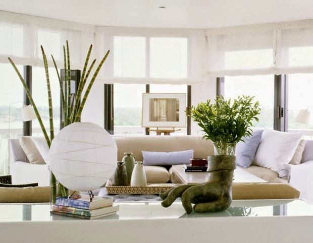
His background in photography obviously informs his interior design aesthetic or maybe it's the other way around. When I look at any space he has created, I see so many compositions within compositions, layers that cause you to look throughout his spaces. I am also sure they are photographed to make you do just that.
The artist in me is attracted to how he organizes random objects into vignettes (object compositions). So after much viewing, thought, and reading, here's what I've learned from this brilliant, self-taught, New York designer.
Repeat still life elements
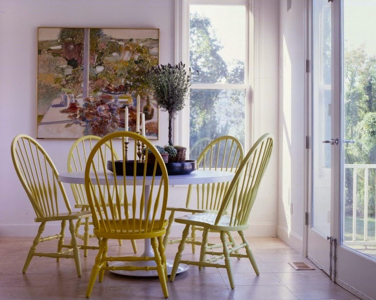
Wolf often uses a painting to inform a vignette created near it. Elements are repeated from the artwork as in the tree and scrubby plants in the tray.The three candles mimic the strong vertical in the left of the painting and there's really three table tops- one in the art, the table itself, and the tray on the table.
Layer furniture
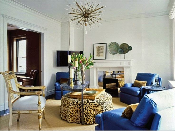
Not only is layering furniture a way to deal with limited space and provide versatility to meet various entertaining needs, it is also an effective strategy to provide visual interest and a focal point in an otherwise simple space. I like how the large ottoman (often a signature piece for Wolf) is the only pattern in the room. It is also a way to move circular shapes around an otherwise rectangular space.
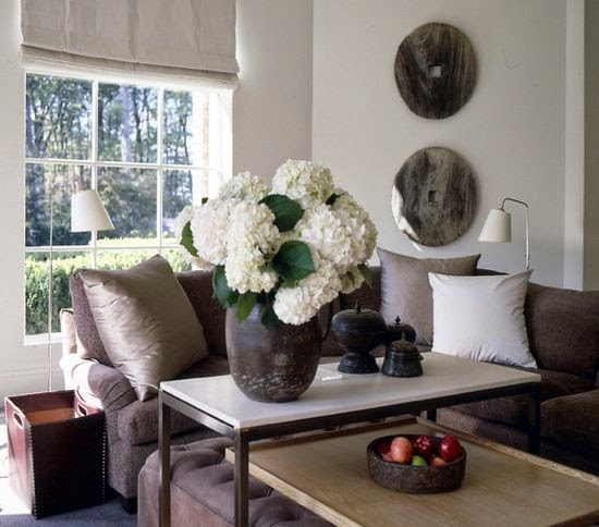
Another idea for layering a table and an ottoman. Circular motifs play in this space too. Have you noticed the use of higher tables?
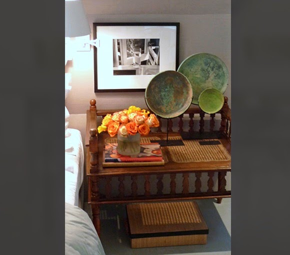
Circular motifs and layering under a bedside table. The textural and
geometric elements of pieced or woven wooden elements are also
prominent as you can see below.
Use texture and geometry in wood
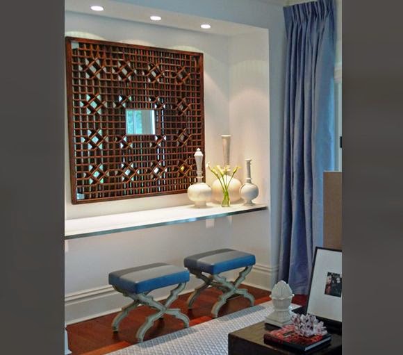
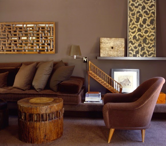
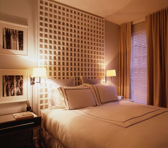
Suspend mirrors/art in space
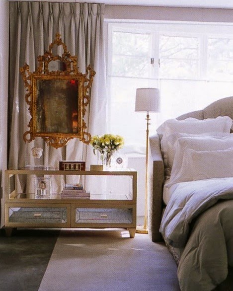
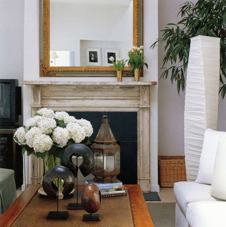
This vignette illustrates how to organize objects and frame them with what lies behind. In this case the fireplace frames the vignette in front of it. I also love how the mirror acts as an additional backdrop element in this vignette.


